- Abstract
- Foreword
- Introduction
- Elements
of the Exhibit
- User Interface
Design
- Methodology
- Conclusions
- Afterword
- Exhibit
Credits
This paper describes the implementation of an interactive computer-based installation at the San Francisco Exploratorium, inviting visitors' reflections on nomadic design practice in everyday life. As they inspect the contents of their bags and pockets, participants enter images, words, and sounds in a networked multimedia database. Nomadic profiles created by previous visitors are available for comparison and contrast with one's own. The Portable Effects exhibit augments conventional graphical user interface (GUI) elements with a complement of tangible affordances for encouraging participants to think with their bodies as well as with their minds. This installation was developed by a multi-disciplinary design team, following an iterative strategy with throwaway prototypes, to provide an interactive experience that provokes self-discovery.
Everybody is a designer in everyday life. Yet we share no common vocabulary for describing everyday design practice, and few would even claim to have a coherent method for pursuing it. Through glimpses into human mobile nature, Portable Effects is an exploration which prompts each of us to consider the design motives and methods that underlie people's daily transactions with ordinary objects.
Individuals' selection and arrangement of the things they take with them-in handbags, pockets, briefcases, backpacks, etc.-form the context of the investigation. Between setting forth in the morning and returning home at night, each person lives nomadically for several hours a day. You can't take everything with you-neither in your backpack nor in your head. Identifying essentials-figuring out how to contain, arrange and keep track of them as you go-are instances of design thinking. A purse is a physical container, a changing array of interrelated functions, a prosthesis for memory, a haptic "user interface," an information system. The life size lessons of purse design and pocket organization may be adapted to larger and more complex 3-dimensional problems that frame our ephemeral earthly experience.
In 1995 Interval Research Corporation and the Exploratorium embarked on an experiment to develop an exhibit that would be a Survey of Nomadic Design Practice.
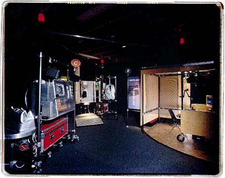
Figure 1. the Portable Effects exhibit in situ
What Makes a Good Exhibit?
Compared with electromechanical demonstrations of physical phenomena-long regarded as a hallmark of the Exploratorium-the Portable Effects experiment took us in the direction of computer-based exhibits that engage a visitor's reflective mind in the exploration of abstract principles. As the information age unfolds, exhibit designers at the Exploratorium are cautiously evaluating the costs and benefits of introducing more computers to the floor. They hoped to gain a fresh perspective by letting us grapple with the problem in their midst. For Interval, entering a collaboration with the Exploratorium promised an opportunity to engage the visitors themselves as participants in our Portable Effects exploration, and to collect data about nomadic design practice from a large population sample.
Our design brief, drafted in cooperation with Exploratorium exhibit staff, called for creating an architectural environment and a system of interactions that would prompt visitors to consider the objects they carry every day and capture the sense of their transactions with these objects. We speculated that participants would gain some insight about themselves in the process-"The things I carry are extensions of me." "Everyone has a different scheme." "I pack these things for a purpose." Or "Aha, I do practice design every day." The exhibit that grew from this interactive experience would be a cumulative affair-an audiovisual inventory of the things that visitors bring to it, and the purposes and meanings they ascribe to these things. As individuals articulated their schemes of collection and sorting, they would have an opportunity to add their profiles to an extensible database, as well as to compare their own portable survival tactics with those of other nomads.
With more than 1,000 visitors per day, the Exploratorium floor affords an exacting experimental laboratory for testing novel models and techniques of interaction. It also exposed us to the rigors of designing computer interfaces that are sufficiently rugged to withstand the brutality of eight year old boys. We were eager to learn from the seasoned exhibit developers at the Exploratorium about methods they employ in designing, prototyping, and evaluating interactive experiences, within a setting that attracts visitors of various shape, size, focus, skill, and attention span.
Two underlying motives which guided our design approach should also be mentioned:
For one, we were determined to let visitors discover something on their own-by stepping them through a design process, rather than telling them what to notice. We wanted them to articulate what their things were for, rather than asking them to sort the things into categories predefined by us. We hoped they would realize that there is no single "correct" answer to the nomadic design predicament, and that they would take an interest in the complex and idiosyncratic solutions devised by others. We hoped to call their attention to diversity, rather than to norms.
Secondly, we were inspired by the direct physicality that characterizes traditional Exploratorium exhibits-particularly the ones with simple electromechanical input and output. We wanted to create a multimedia computer experience that would engage people's bodies as these mechanical systems do. We wanted visitors to think physically about the consequences of portability.
System and Software
The Portable Effects installation runs on seven Macintosh™ computers connected to a local Ethernet™ hub. Of the three primary stations, two are for input, one for output. The input applications add information to a shared database; the output application displays that information. All three of these custom applications are built in Macromedia Director 5.0™, and use purpose-built Xtras™-external code modules created with a specific protocol for communicating with Director™.
The exhibit makes use of a relational database engine which is easily accessed from Director™. Since the engine doesn't accommodate multiple users, different copies of the database file are stored locally on each machine, and information is passed between the applications indirectly, via a shared server. Because the engine stores only alphanumeric data, the still images and audio are stored separately, in files whose names can be generated from text fields in the database.
The Unloading Dock
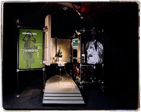
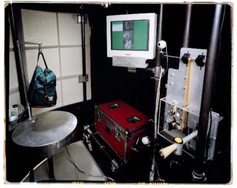
Figure 2. the Unloading Dock-input station A
Conceived as a multi-input photo booth, the Unloading Dock invites visitors to consider how they carry their stuff. The station employs two industrial weighing scales to determine the ratio of a person's body weight to the weight of the stuff carried. It is equipped with three Connectix QuickCams™ that snap photos of each visitor's face, bag, and feet. In lieu of a trackball, a large handle is provided for navigation and selection. The scale recessed in the floor also notifies the computer when somebody is present. To 'QUIT' the program, a visitor need simply walk away.
The Inspection Station
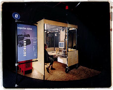
Figure 3. the Inspection Station-input station B
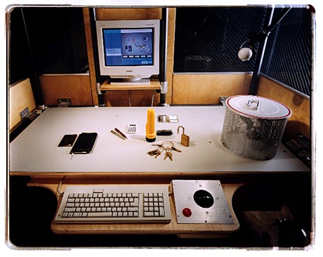
The second input station is called the. Here you are prompted to consider the collection of things that you happen to be carrying, and to ask yourself what these things are for. Virtual affordances-for sorting, arranging, and recording-augment tactile exploration and physical manipulation of one's personal objects. Seated before a table in this intimate-almost confessional-space, visitors enter data with keyboard, trackball, microphone, and two video cameras.
The Portrait Gallery
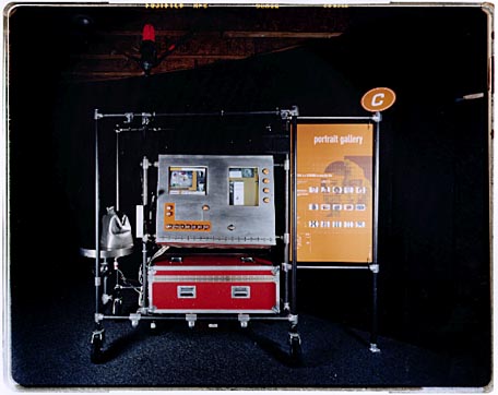
Figure 4. the Portrait Gallery-output station C
The Portrait Gallery is the primary output station. Here individuals can compare their own nomadic design choices with the solutions of other visitors. Flashing buttons and a Las Vegas slot machine handle are the input devices for a guessing game that challenges participants to consider "Who might carry this stuff?" The station uses a digital IO board to gather button input and to control button lights.
Once a visitor has tried the game, she can browse through the self-portraits that previous visitors have created. Each portrait is a composition of images, sounds, and text that were recorded through a series of transactions conducted in the Inspection Station and the Unloading Dock. A visitor should be able to find his own nomadic portrait in this collection without too much trouble, or invoke simple sorting operations to explore similarities and differences among the other portraits.
Talking Bags
Two additional output stations-the Talking Bags-use Macintosh PowerBooks™ to play samples of audio, text, and image that visitors have recorded in the Inspection Station. One Talking Bag is hidden in a doctor's valise, the other in a photographer's vest. (See Figures 1, 2 and 4.)
Handles on Media
As Interaction Designers, we learned a lot from watching Exploratorium visitors work the exhibits-especially the traditional mechanical contraptions mentioned above. People enjoy moving their bodies and their limbs-yanking, tugging, reaching, spinning, squatting, jumping, touching and blowing-as they interact with these devices. The devices, for their part, yield unambiguous sensory feedback. Obviously they must be rugged enough to withstand a lot of abuse. Because access is immediate, and the protocol for disengagement can be as easy as walking away, these exhibits allow rapid turnover and readily accommodate throngs of visitors eager to have their turn.
A cursory survey of several Internet terminals scattered about the museum, as well as the garden-variety multimedia kiosks that proliferate nowadays in public spaces everywhere, will suffice for contrast. Amidst the Exploratorium's cacophony of sights and sounds, Web browsers and CD-ROMs do not deliver enough sensory stimulus to sustain anyone's attention for long. We witnessed distracted users trying to initialize the program or "log in" for several minutes. They sit and stare impassively at the small screen for a spell, straining to hear the audio. Except for the hand on the trackball, the body remains motionless. Once a person has had enough, she wonders how to find the 'QUIT' button. Those who simply abandon the effort without closing the program leave it for the next unwitting visitor to discover in midstream.
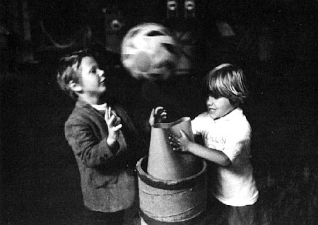
Figure 5. Do and Notice. Two visitors experiment with aerodynamics. Photo courtesy Susan Schwartzenberg, Exploratorium.
Encamped on the Exploratorium floor for several months between an active cyclone and the bubble soap vats, we were challenged to consider how we might transpose some kinesthetic advantages and physical affordances of the mechanical interfaces to our own computer-bound artifacts. Our iterative approach to design development launched us on a firsthand exploration of the tradeoffs between established Graphical User Interface (GUI) paradigms and more physical, or Tangible User Interface (TUI) possibilities embodied in the older exhibits. Along the way, our story took several curious twists.
Trading off Physical and Virtual Affordances
Our early floor tests relied on standard system configurations with GUI for rapid prototyping with Director™ on readymade Macintoshes™. We had initially predicted that many visitors would require help entering data with a mouse and keyboard, or simply throw up their hands in disgust. To our surprise, people who had any trouble, or expressed any hesitations regarding the interface, were extremely rare. When it came to keyboard input, young children were apt to be the most patient and meticulous. (We wonder whether the astonishing rate of GUI literacy is a phenomenon unique to the Exploratorium's public, or to San Francisco residents, or is it common among Americans under 50?) Furthermore, as we began to replace familiar input devices with handles and scales, and to implement Tangible UI schemes (not to mention cases where we had neglected to include certain GUI conventions, such as tabbing to text boxes), there was incontrovertible evidence that our noble intentions were confounding the UI ease of use. This development prompted us to recalibrate our former beliefs about the difficulty of implementing a full-blown GUI for a museum setting.
As a result, two distinct paths of action emerged.
GUI Got You
With the Inspection Station, for example, we realized that by leveraging off the public's familiarity with GUI conventions, we could offer participants an experience that was far more sophisticated than we had originally considered feasible. Better described as "a conversation with the materials of the situation" [5], this experience involves a sequence of ten activities that can engage visitors for as long as 30 minutes if they are carrying a lot of stuff. A constrained interaction path connecting the activities, with clearly marked steps, allows people's attention to focus on interactions with their objects rather than with the system.
Figure 6. Inspection Station UI with portable effects on table
With one hand on the trackball and the other handling things spread out on the table, the boundary between physical and virtual sometimes became so blurred that, on more than one occasion, we were amused to witness people attempting to move one of their belongings by clicking on its live video image.
Back to Body Language
We remained hopeful that visitors would also engage spontaneously with custom-designed TUI affordances such as they had never encountered previously. As designs for these contraptions evolved in response to floor tests, we noticed that we increasingly exaggerated the gadgets' physical characteristics for the sake of counteracting people's awareness that they had computers inside.
Figure 7. Unloading Dock UI with handle on right (full length mirror removed to reveal handle mechanism)
We outfitted the Unloading Dock with a pointing device in the form of a large handle. Mounted on a lever at waist height, the handle pivots vertically. Visitors use this single-axis input device to move an on-screen cursor through a menu of human body positions that are oriented from head to toe. In order to make a selection, the participant must press a button attached to the handle.
Initial prototypes for this device were so unassuming that visitors simply missed it. The mere presence of the computer monitor evidently prompts people to look for more recognizable input devices, such as keyboards and mice.
To induce people to notice the handle, we oversized its dimensions and refabricated the button mechanism in eye-catching yellow. We linked the screen to the handle with a prominent yellow line. Eventually we tossed subtlety to the wind and added an audio prompt for good measure. Next we plan to install a light inside the button.
In addition to this handle and three cameras, the Unloading Dock also employs two weighing scales as input devices. For data-gathering purposes, the scale built into the floor weighs each visitor. A second scale, masquerading as a gentleman's valet, weighs the load that the person is carrying. To spare people from their obsessions with body weight, we took extravagant care to express these values as a ratio-a "load percentage"-rather than display absolute numbers of pounds.
The less obvious purpose of the scales is sensing visitors' presence. For years Bill Buxton has been challenging UI designers to add presence-sensing to computers. He claims it was a visit to the washroom in O'Hare Airport that prompted him to ask, "Shouldn't my computer be as smart as the toilet?"[1]
Because the scales enable the system to detect people's arrivals and departures, it requires no guesswork on the visitors' part to initiate or terminate the interaction. The system even sounds a verbal caution-"Don't forget your stuff!"-if you start to walk away before retrieving your bag.
Troubles with Gizmo-GUI
Merging GUI conventions with tangible affordances in a manner that made any sense to visitors proved to be a trickier proposition.
Our preliminary sketches for the Portrait Gallery borrowed the model of Las Vegas slot machines as a familiar interaction premise-appropriate, we thought, for a game. Yet our initial prototypes used standard mouse and keyboard configurations, which visitors mastered more readily than we had predicted. Encouraged by this early success, we failed to calculate the advantage we would lose as we proceeded to replace the GUI devices and screen conventions with more tangible interface controls.
Intent on the physical metaphor of slot machines, we had proposed to frame the computer as something that was not a computer. In fact we were creating a hybrid that confounded visitors. We started with the 'NEW GAME' handle on the right side of the box-just where it is located on real slot machines. Because our box was three times as wide as a real slot machine, visitors seldom found this handle. We eventually moved it to the left side of the box. The reason the box was so wide was that it held two 17" computer monitors. We supposed that visitors would read the two screens as a joined display-like a Macintosh™ desktop distributed across multiple monitors. They didn't. The two screens looked more like the individual panes of a real slot machine. In order to establish a visual connection, we had to add animated graphics that moved from one screen to the other.
The sturdiness of mechanical parts proved to be enormously consequential for several reasons that we had never previously considered. For one, things that do not work frustrate people who try to use them. In a museum setting, such frustration is sometimes vented through physical assaults on the apparatus in question. Secondly, refining the details of interaction is a sufficiently difficult task even without unreliable input devices to compound users' troubles. A couple of lessons emerged:
- When trying to diagnose
an interface problem, be sure to fix any mechanical problems first.
- Over-engineer each component, or else consider it expendable. Plan for frequent replacement of mice and keyboards.
Installation Architecture
The environment where an interactive exhibit is situated-and the space that the installation defines-are the first order of user interface that visitors encounter. Contrary to many museum professionals' idea of computer-based exhibits as touch-screen systems that either sit on tables or stand inside of columnar structures, we wanted to encompass the computers in an environment that would embody the physical dimensions of portability, and also articulate the adaptive strategy at the heart of nomadic design practice.
A system of modular structural components-inexpensive steel pipe sections and aluminum alloy slip fittings-enabled us to experiment with different configurations of the individual stations, and to iteratively refine hardware placement without much effort. The stations are sized to fit through a standard doorway. Outfitted with industrial duty rubber casters, they can be corralled in different arrangements to fit a variety of sites.
We made a concerted effort, with color coding and environmental graphics, to make the network scheme legible. Suffice it to say that visitors do not always read.
Audible User Interface
The addition of sound fulfilled several purposes: assisting navigation, confirming specific mechanical actions (and making them seem more vivid), monitoring slower processes, and providing warnings. These are functions which have been discussed by Bill Buxton [2], Bill Gaver and Randall Smith [3]. Sound also serves to attract visitors to the exhibit, and to provide an ambiance for each particular station as well as the exhibit as a whole.
We chose a sonic palette that would not deter people from talking to one another. This palette consists of very low tones, very short sounds, and music that was primarily pitched percussion.
Sounds were mapped to individual properties of each station, in order to endow the stations with distinctive personalities. For example, the portrait guessing game begged for comical sounds, such as pops, whistles, and synthetic warbles, to make it feel more game-like.
Long musical passages (up to 15 seconds) enliven the stretches of time when stations are resetting themselves. Shorter phrases or low background tones fill periods when files are loading-letting visitors know that a process is underway. They also create a cohesive sound environment for each station.
We used voice prompts in the attract modes of each station as a way to get participants started-"Put your feet in the square," or "Pull the handle to begin." We also used voice prompts to help people through rough spots that we noticed during testing, or to call their attention to choices they might have missed-"Use the 'CHECK MATCH' button to check your selection," or "Place the object on the stand. The stand is on your right."
Audio provided by the visitors themselves makes the Inspection Station attract mode more attractive. People's stories about their objects, and the sounds of objects getting jangled and tooted, are woven into an ever-changing audio collage.
Thankfully, we never had to contend with the noisy acoustical conditions that affect most Exploratorium exhibits. The Portable Effects installation got a room to itself, where sound volume and balance could be adjusted according to the ebbs and flows of the crowd.
The lively and coherent audio ambiance which the exhibit attained can be attributed to our use of a constrained sonic palette, configurable volume and balance controls, and the integration of sounds among stations.
Exhibit design at the Exploratorium is conducted like experiments in a research lab. It's their view that every exhibit is a work in progress, and the exhibit floor is occupied by a collection of prototypes, all in varying stages of development and refinement. The reactions and responses of visitors, not to mention uses people find for things that never occurred in the exhibit developer's wildest imagination, provide the feedback that shapes the purpose and form of the installation design.
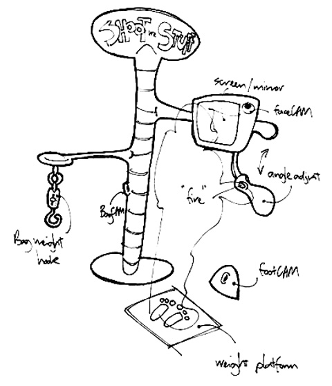
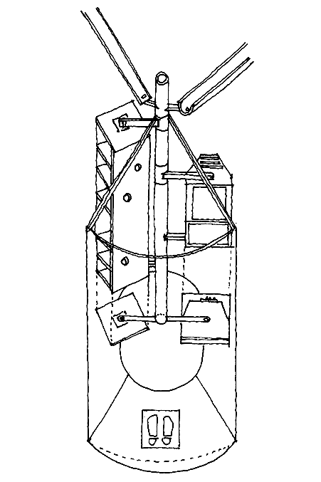
Figures 8 & 9. early concept sketch and later architectural development drawing for the Unloading Dock
From the outset of the collaboration, our counterparts at the Exploratorium were prodding us to move our ideas off of paper and onto the floor. Lacking time for any elaborate preparations, our first floor tests involved no computers at all. One afternoon we connected a video camera to a projector, to find out if visitors would be willing to disclose the contents of their bags and pockets in public view. They were. Another day we installed a bag check station in the middle of the floor-complete with redemption tokens-in order to determine whether visitors would be willing to park their bags. They weren't.
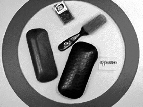
Figure 10. Early Wizard of Oz prototype for the category activity
An exercise with post-its and cutout paper rings required people to create several distinct categories which collectively accounted for all contents of their pockets and bags. Variations on themes of floor tests one and three became the basis for the Inspection Station.
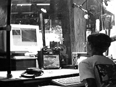
Figure 11. Visitors try out a prototype of the Inspection Station
The regimen of floor tests provided the attraction that compelled our development team to coalesce. We were an eclectic group, whose regular jobs include architecture, filmmaking, industrial design, software engineering, interaction design, fashion design, and dance. Brief alliances produced competing designs through sketches and brainstorms, with the shared goal of devising testable prototypes.
An early non-interactive prototype of the portrait guessing game was mocked up in Director™. This demonstration was enough to convince us that the primary object of the game was coaxing visitors to infer correlations between individuals and the stuff they carry. Additional coding transformed the click-through demonstration into our first interactive and testable version of the Portrait Gallery.
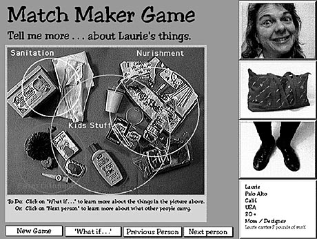
Figure 12. Early point-and-click prototype of the Portrait Gallery
Several prototypes of the Inspection Station, which included versions of the category activity, and a "What If" question-"If you carried a pint of ice cream up a mountain but forgot the spoon, what did you bring that you could use instead?"-were also tested on the floor.
It was these tests which first gave us the clue that, whether or not children happen to be interested in the ideas of the exhibit, they are simply wild about seeing themselves on camera. The Exploratorium doesn't believe in interfering with exhibits on the floor, but we were impelled to intervene one morning when we found six rowdy eight-year-olds piling themselves on a small table under the inspection camera.
Young visitors added numerous pictures of middle fingers to the database during this phase of development. In response to such provocations, we devised a way of censoring the exhibit that did not require some authorized person poring over the content. A visitor's record is only added to the database if she completes all the activities at both input stations (and gives permission for her data to be saved). Most finger-photographers don't have the patience to get through both stations.
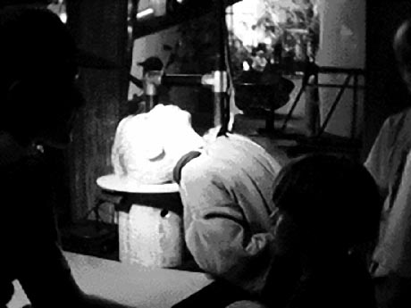
Figure 13. young male visitor puts the Inspection Station to an unintended use
Patience was a recurring theme in our design discussions. The reflective style of the interactions we had choreographed demanded more time and attention on the part of participants than typical electromechanical exhibits. We believed that every visitor should be able to glean something from the Portable Effects exhibit, even if she couldn't stay long enough to do everything that was there. The Inspection Station requires the most effort, and frequently people must wait to have a turn. We added the Talking Bags for simple peeking, and a video station playing documentary clips that visitors need only watch. The environment accommodates another level of participation as well, such as watching someone else go through the paces at the input stations, or joining another visitor's guessing game.
As we ventured cautiously into the physical interface domain, we used "Wizard of Oz" techniques until we were satisfied that it was worthwhile to invest in further engineering effort. An early Unloading Dock prototype employed two scales, but the wizard read the numbers and calculated the load, then typed the percentage on a keyboard, which caused it to appear on a monitor as if the computer had performed the calculation.
The life span of such prototypes was typically a matter of hours, and rarely exceeded a week. Since usability test subjects were in plentiful supply, we could try out new ideas at a moment's notice. To attract subjects, we simply had to put up a sign that said "exhibit now open." By the time we turned our attention to the task of machining durable hardware interfaces and writing C code Xtras™, the floor tests had already unraveled innumerable kinks in our preliminary thinking, and spun the design in directions we could never have otherwise conceived.
Most Exploratorium visitors who participated in our floor tests have already become so familiar with GUI protocol that it's practically second nature by now. Our experiments integrating tangible affordances with GUI suggest that this second nature is of a different kind from the kinesthetic nature that characterizes our thinking bodies in the physical world. The instinctive responses of these two natures are sometimes at odds.
Compared with designs which are produced in the mind's eye of the designer, the foremost object of the rapid prototyping design cycle practiced on the Exploratorium floor is never the end result. Rather, the persisting goal is to devise the simplest of experiments and the most expendable apparatus that will make it possible for visitors to test and further the ideas of the design. According to this scheme, the results will take care of themselves.
During our preliminary design sessions, and throughout the early floor tests, we were plagued with anxiety that the reflective style of interaction which suited our pedagogical objectives simply would not give Exploratorium visitors sufficient motivation to linger. If nobody took the time to go through the input stations, we would wind up without any exhibit. Therefore, we took every opportunity to insert small rewards in the process-explicit comparisons with trends captured in the database, musical flourishes, and interesting facts. In retrospect, we need not have worried. We found that people are remarkably attentive when the subject is themselves. Many visitors welcomed an opportunity to introspect, and most of those who took the time also chose to leave a persistent record of themselves. Gitta Salomon has made a similar observation. In a report about the Information Kiosk that was developed for CHI'89, she wrote, "it contained multimedia data about the city of Austin, the conference program, and the people attending the conference. This last point was an important element in its success."[4]
Following two years of design, floor testing, and implementation, Portable Effects: A Survey of Nomadic Design Practice opened to the public from March 1-June 1, 1997. By the end of the three month run, entries in the Portrait Gallery numbered 600 people. Findings of the Survey have yet to be published. We are developing plans for the exhibit to travel, in order to collect nomadic design data from a range of cultures and environments around the world.

